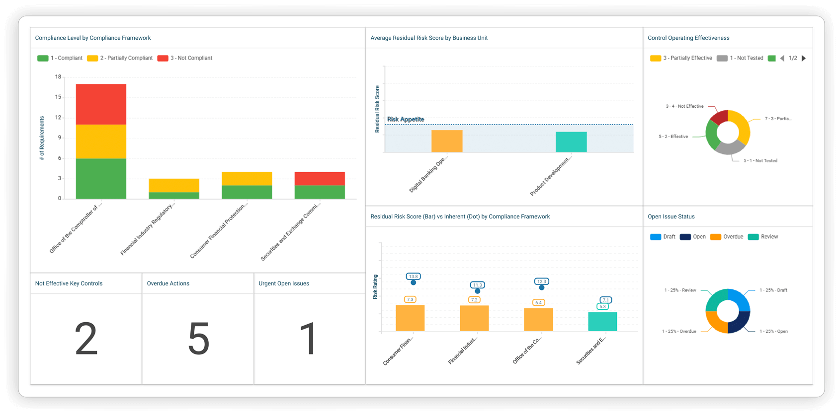
When reporting to executives, your goal shouldn’t be to show them everything. They want details to help them make decisions. A good report details what’s working, what’s not, and where to focus next.
That concept gets lost more often than you’d think. Executive GRC reporting isn’t compiling numbers into one larger presentation. It should feel less like a handoff and more like a conversation. If the report doesn’t speak for itself, someone else will speak for it.
Here’s a breakdown of what goes into executive GRC reporting, how it should be structured, and how to get multiple teams to work from the same data.
Executives ask for dashboards when they want answers
If the executive can’t make a clear decision immediately after looking at your report, it wasn’t done properly. That’s what separates useful reports from a year-end recap.
When it comes to executive GRC reporting, you don’t start by asking what data is available. You start by asking:
- What’s the focus of this?
- What’s the outcome we’re trying to drive?
- Who’s reading it, and what do they care about?
If you’re presenting to a CRO, you’re showing performance against risk appetite. If it’s an audit committee, you’re showing control health. If it’s the board, you’re showing what’s going wrong and what happens if it continues. Each calls for different data, different visuals, and different priorities.
Your goal should be creating purpose-built views with a defined outcome and a limited attention span. You’ll get five minutes and a few questions, so make sure:
- You are honest about what belongs: There’s a tendency to pull in every metric. That doesn’t build trust, it confuses the message.
- Each chart supports a single point: If you’re showing a control failure trend, the next chart should show its impact or the action being taken. If you’re showing an issue, it should be linked to the risk or control it affects.
- The report tells a story: Does the report tell a cohesive story that that leads to discussion and ultimately a decision?
- To incorporate shared structures: When risks, controls, issues, and audit findings are linked across functions, you can stop building one-off reports. Working from the same source means the message comes through clearly.
Readers will naturally read left to right, so crafting a dashboard that tells a story without skipping around or without a clear focus is essential for communicating your results and insights. A well-crafted report will do all the talking for you.

Start with a shared foundation, not a shared file
A lot of teams build their reports in silos. Risk builds theirs, audit adds on, and compliance tacks on a few charts. You end up with three versions of the same problem. That forces teams to spend hours reconciling definitions, reformatting visuals, and revalidating numbers. Time that should be spent on the message, not chasing alignment.
The better path is one shared structure. When everyone works from the same set of risks, controls, and issues, there’s nothing to translate. You’re using the same inputs, tied to the same output. That consistency makes it easier to spot when the same issue is flagged by all lines of defense. It doesn’t mean every team reports the same way, only that the foundation is consistent.
Doing so also keeps the thread intact. A flagged risk can be traced back to the control, the owner, and what’s changed since last review. Compliance issues tie back to business risks instead of being buried in spreadsheets.
A unified structure shows how a single risk connects to a control, then an issue, an audit finding, and even a regulatory requirement. That’s how you tell the full story.
Discover Resolver's solutions.
Where reports go sideways, and what to watch out for
It’s easier to unify data than it is to unify teams. Just don’t mistake unified for overloaded. The point of standardizing the back-end isn’t to limit what people say. It’s to help them say it more clearly, and faster.
Most reporting breakdowns happen before the first chart is even built. You can have the right data, the right people, and the right tools, and still miss the mark. It usually comes down to habits that feel harmless, but end up costing the message. For example:
- Leaning into the tendency to over-explain: Don’t add paragraphs beneath every chart that spell out what the axis means or why the metric changed slightly. Focus on commentary that will help drive decisions, focus on outliers and trends.
- Repeating your messaging: Sometimes it’s the same message shown in five ways. Sometimes it’s a mix of slides from a previous meeting. Either way, they shouldn’t be reused if they’re not relevant.
- Trying to prove how much work went into the report: Teams may overload reports with every chart they’ve touched, hoping more content will show more value. But executives don’t need proof of effort. They need proof of alignment.
- Only focusing on aesthetics: A clean, consistent look definitely helps reports feel intentional. But if the fonts and colors are polished and the content is still vague, that polish becomes a distraction. A sleek design doesn’t make up for a weak narrative.
The hardest part of executive GRC reporting isn’t pulling numbers. It’s shaping them into a story that points the reader to a decision. When the structure is missing, leaders get data without direction, and the opportunity to act with confidence is lost.
How Resolver helps show value in your reports
Strong reports start with final decisions. To get there, you work backward: what’s the point you’re trying to make, and what’s the one thing that needs to land? The goal is being able to tell your executive team that you saw the issue, fixed it, and are performing better now. That’s when GRC earns the seat it’s supposed to have.
Resolver’s GRC Suite clears the path to make it possible. Shared data structures mean you’re not stuck cleaning up spreadsheets from three departments. Everyone’s working from the same risks, controls, issues, and findings, so the message holds up. Cross-functional links between risks and findings make it smarter. And flexible dashboards mean the view can shift without losing the story.
Want to see how Resolver helps teams make their executive GRC reporting more effective? Book a demo today to see how it fits.
About the author: UK-based Ben Bradley has spent his career understanding the challenges of Governance, Risk and Compliance teams, eliminating pain points in their systems and processes. As a GRC Product Manager, he brings his deep knowledge of creating customer solutions to optimizing and improving Resolver’s GRC products with daily users in mind.


